Venmo
Seamlessly integrating a bill split function within Venmo’s existing user interface infrastructure
My end-to-end UX process from discovery research through usability testing
Project Background
I’m an early adopter (2012!) of and still remain a very frequent (daily) user of Venmo. For those located outside of the U.S., Venmo is one of the most popular instant money transfer apps in the U.S. marketplace. It has become so ubiquitous within my network and community that I cannot remember the last time I used cash or wrote a check.
There is no doubt that Venmo has created an abundance of ease, security and convenience around a process that was anything but these things for the greater part of human history. So who exactly do I think I am carrying around my wishlist of Venmo updates that I’d desperately love their product team to implement???
Well, I’m just me! I’m one user out of millions and maybe even, dare I say…an edgecase! So instead, I went straight to the source and interviewed Venmo user’s.
The User Informed Problem
My research uncovered that overwhelmingly Venmo user’s are looking for an easier way to split bills amongst multiple people. Although this CAN currently be done in the Venmo app, every single one of the 24 research participants were unaware of this function. Additionally, this function is extremely limited in its current implementation. The user’s were telling me this feature needed an overhaul.
Project Overview

Design Process
The Design Thinking framework guided my entire design process from discovery research to usability testing.

Phase 1: Empathize via Research
Research Planning
Research Goals
Understand any pain points Venmo user’s experience with the current Venmo product.
Research Methodologies
Competitive Analysis
User interviews
User survey
Participants
Weekly Venmo users
Assumptions
I assumed that user’s would want a search and filter feature added to their personal transaction history. Why did I assume this? Well simply because that’s what I’d love to see implemented!
Challenges
Identifying this bias pushed me to conduct fair and unbiased research.
Competitive Analysis

Competitive Analysis Insights
Although Venmo users CAN currently split an expense between multiple users, every single one of the 24 research participants were unaware of this function.
Broadly, money transfer apps do not support scheduled money transfers, bill splitting or group expense consolidation.
Discovery Interviews
I interviewed 3 weekly Venmo users in order to understand which Venmo app features they use, why, and if there were any pain points associated with their Venmo use.
A few patterns emerged:
100% of the participants only used the money transfer feature
None of the participants identified the same pain points

Discovery Survey
Because my interviews had yet to clearly identify any pattern of unmet user needs I surveyed 24 users with the hopes of uncovering user experience trends.
What I learned:
100% of respondents use Venmo weekly
100% of respondents did not use the crypto market place or the debit card features of Venmo
100% of respondents used the money transfer feature
91% of respondents only use other money transfer apps if Venmo isn’t available
52% of survey respondents identified bill splitting as an unmet need
Scheduled payments (29%) and Search/Filter Transactions (18%) were the next most identified

Phase 2: Define via Research Synthesis
POV Statement
Venmo users want to be able to split bills with multiple users within one transaction because doing the math outside of the app and charging multiple people through multiple transactions is tedious and prone to error.
How Might We’s
How might we incorporate this process into the existing Venmo infrastructure?
How might we utilize common design patterns to facilitate understanding and ease of use?
User Persona
Meet Josh, the Venmo user seeking a bill splitting feature.

Empathy Map
How Josh behaves.

Defining Project Goals
Discovery interviews, competitive analysis and industry data allowed me to confidently define product goals and features.

Phase 3: Ideate via Research and Design
Information Architecture Assets
Task Flow

User Flow

Wireframing
My process begins with rough lo-fi sketching on paper. After this step I transfer potential design solutions into Figma where they are refined to become hi-fi wireframes.


Phase 4: Prototype via Design Ideations
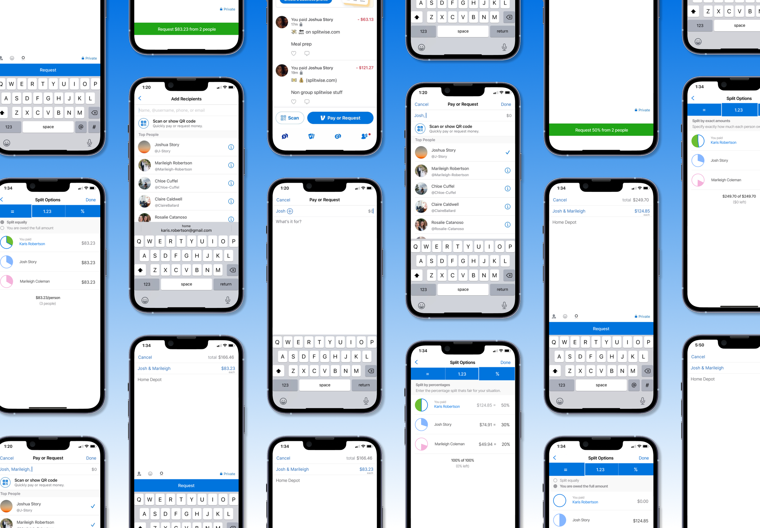
This prototype allows users to split one bill with multiple users through four split options and an upload receipt option.

Phase 5: Usability Testing via Prototype
Usability Testing
Goals
Understand user expectations and experience with the added split payment feature.
Determine if there are any pain points associated with use of the added split payment feature.
Determine v2 updates based on user feedback.
Participants
Number of participants: 2
Weekly Venmo user’s
Methodology
Testing will be conducted remotely
Participants will navigate the prototype while sharing their screens over zoom
User Tasks
Task 1: Split a bill with Josh and Marileigh.
Task 2: Split a bill with Josh and Marileigh by uploading a receipt.
Usability Testing Insights
Successes
100% of testers felt the task flow was easy enough to use and understand
100% of users felt that the copy was helpful and instructive
100% of users said that the circle illustrations were helpful in understanding how the bill was split
Pain Points
100% of users thought that the QR scan function would also scan their receipts
The added “You” in the participants field was confusing to users
The ability to request money for other people introduces an additional feature
The scan receipt feature introduces an additional feature
Suggestions
The process for assigning itemized bills to different users could be simplified by having a default even split selection
Focus on finessing one feature as opposed to adding many

Flagged Revisions
Simplify the bill split process by having the most common split patterns become the default settings
Focus on implementing only ONE new feature instead of many
Work within the existing UI infrastructure instead of creating new patterns
Prioritized Revisions
All testing feedback indicating a pain point was countered with an updated solution in the v2 prototype. All pain points were addressed because they were reasonable to implement within the resource and time constraints of this project.

I removed the user’s ability to scan a receipt in order to focus solely on refining the task flow and design patterns of the bill split feature.

Realizing I was implementing too many features at once allowed me to see that I was diverting user’s away from Venmo’s highly prioritized 1-on-1 transaction flow. In v2, you’ll see that the default transaction remains 1-on-1 but still signals to user’s that they are able to add additional recipients.

In v2 I implemented the ability to edit the transaction total. This takes into account the possibility that a total could be split unequally.

Further simplifying my approach, I removed “You” from the recipient field. This edited, v2, transaction model is consistent with Venmo’s current approach. Instead of implementing new use patterns, this consistency allows for a seamless user transition into the split function.

v1 allowed users to request money for others. This action was discontinued in v2 because it fundamentally changes Venmo’s current transaction model.

v2 consolidates the equal split options and relocates them to the same access point. As a result, the checkmark function was rendered null and removed.

The user responsibility totals were updated to reflect Venmo’s current UI treatment of totals.

The following updates were made to the request screens in an effort to work within the confines of the existing Venmo business and UI infrastructure:
Access to the bill split settings via a tap on the highlighted requested amounts (instead of introducing a novel link and line item).
As a result, the redundant label of the bill split option was removed and now only shown within the requested amounts
The request button now spans the entire length of the screen because user’s cannot send payment requests on behalf of others
Updated User Flow

Updated Prototype
Task: Split a transaction between Josh and Marileigh.


Takeaways
Implementing a new feature within the confines of existing business, design and development frameworks was both challenging and rewarding.
Rising to the Challenge
Prior to this challenge, I had not designed within the context of predefined constraints. As a result, my first prototype included multiple new features that ultimately veered away from Venmo’s established design patterns and business priorities.
I used the opportunity of user testing and my 2nd prototype iteration to reconsider these aspects and ultimately allow them to inform a more focused feature implementation.
Realizing Rewards
This was my first project designing for an existing product. As a result, I learned how to tailor my design process to account for the predefined user, business and design constraints inherent in an established product.
Re-evaluating my designs as well as my design process is a constantly evolving process, one that I aim to improve and strengthen with each iteration.